Looking directly at the Sun during an eclipse can damage the retina in seconds, painlessly. We use illustrations to explain the different types of eclipse, what happens to an unprotected eye, and the only moment it's safe to watch without a filter.
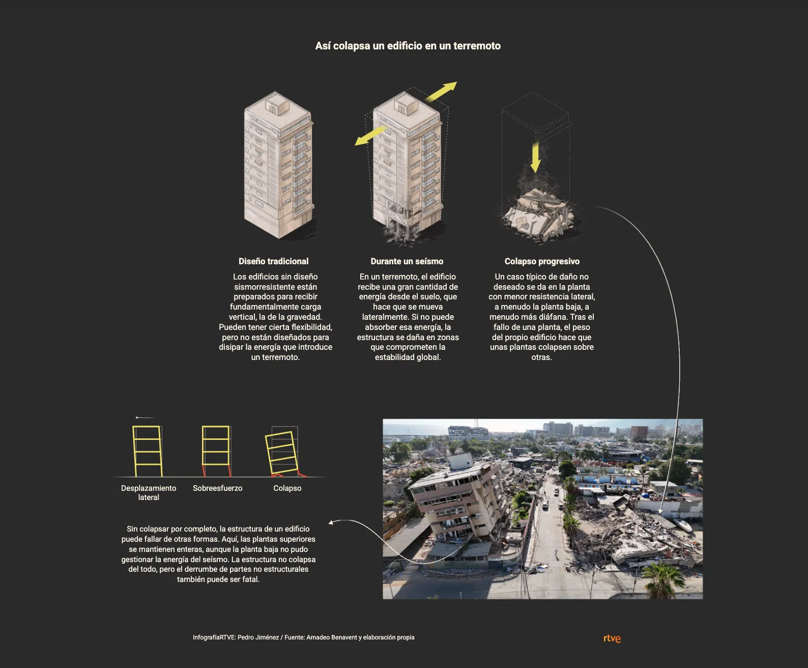
Using the Venezuela earthquake in the La Guaira area as a case study, we use Copernicus-based maps, satellite imagery and infographics to explain why two buildings can respond so differently to the same earthquake, and what construction and prevention challenges remain in Spain.
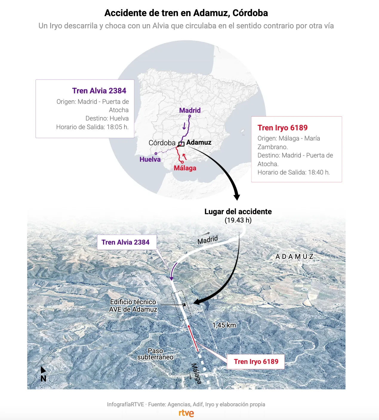
After the collision of two high-speed trains in Adamuz (Córdoba), which left more than 40 dead and around a hundred injured, we used maps and graphics to visualize what is known about the location and the impact between the Iryo and Renfe trains.
Illustrated graphic reviewing all of Rafa Nadal's injuries throughout his sports career, highlighting the major ones. In total, there have been 29 injuries and nearly 2,000 days of recovery.
Visual narrative detailing the siege of Nasser Hospital, narrated firsthand from inside the hospital. Different types of visualizations are combined to offer an immersive narrative.
Data graphic synthesizing Pedro Sánchez's entire 2023 investiture debate and analyzing the time spent by each political party on the concept of 'amnesty' as well as their main defended ideas.
Graphic style design, graphics editing, graphics team coordination and development for the creation of the 2023 Senate and Congress general election results page.
Double-page infographic for Plaza magazine and interactive web adaptation (link broken) visualizing the race for COVID-19 vaccine development through the vaccine study phases.