Heat Health Alerts
Following the new heat alert system launched by the Ministry of Health, we analyze through maps and illustrations the heat thresholds over the last 30 years and the effects of heat on our body.
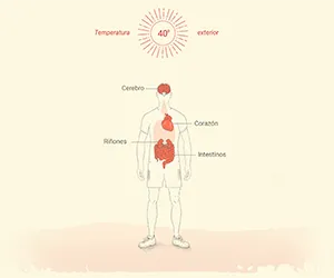
With the Ministry of Health's new heat alert system just launched, RTVE wanted to explain where those thresholds actually come from: not an arbitrary number, but the result of analyzing 30 years of temperature data, cross-referenced with what heat really does to the human body.
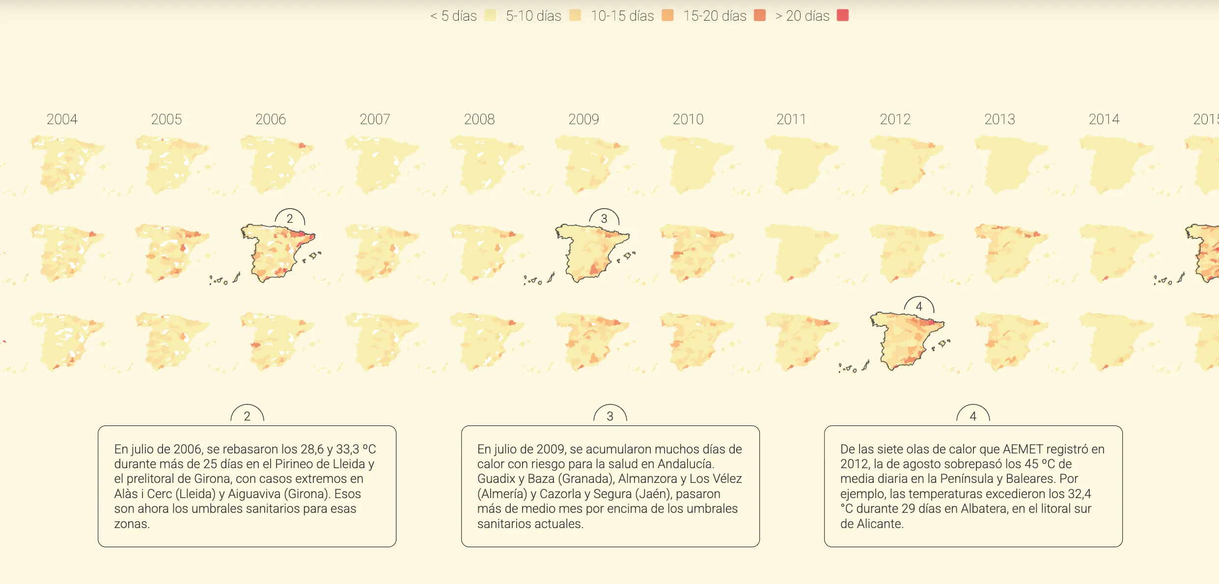
Analyzing, through maps and illustrations, the heat thresholds of the last 30 years and heat's effects on our body, so the alert system would stop being an abstract traffic light.
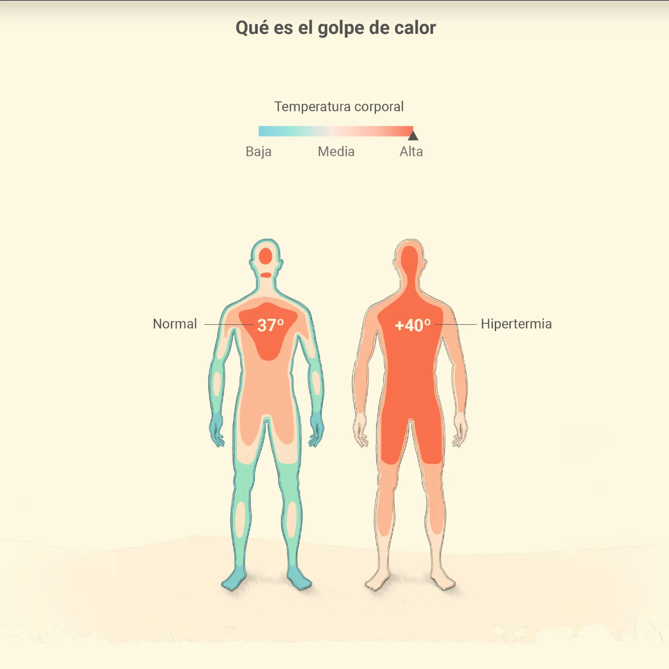
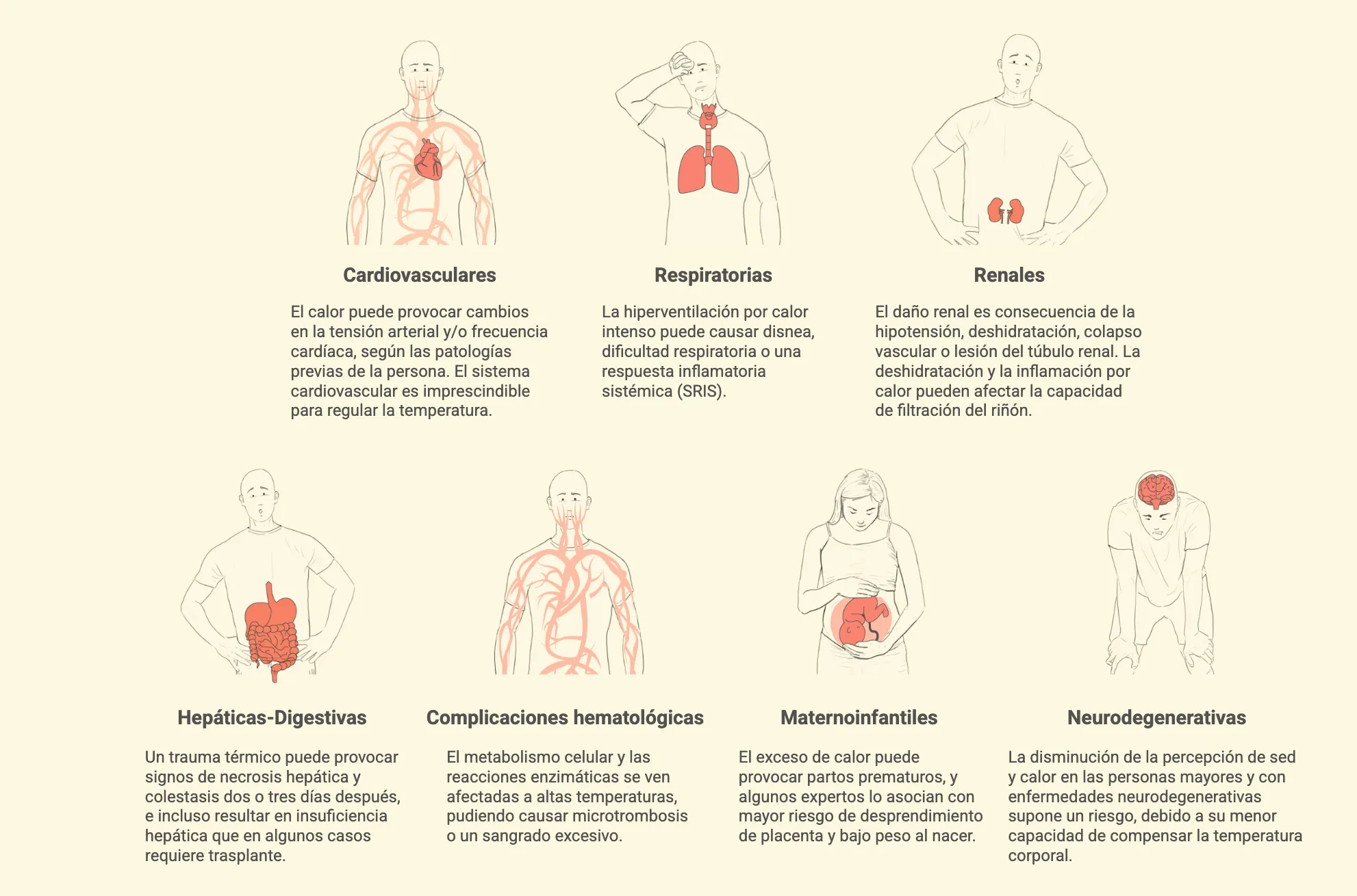
I combined cartography with medical illustration: on one side the historical temperature map, on the other a series of illustrated pieces explaining what happens to the body at each alert level.
Share